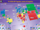
The Social Watch Map 2005
|
Published on Thu, 2009-12-03 08:34
"The Earth is blue" said Yuri Gagarin in 1961 when he glimpsed the planet from the sky during the first manned space voyage. This social world map sizes countries according to their population and colours them according to their rank in the Basic Capabilities Index. Countries in blue provide their inhabitants with a minimum level of social services, while at the other extreme, countries in red face critical situations of deprivation. The colour scale of the circles shows degrees of progress towards gender equity. The governments of the world have agreed to achieve a set of basic standards known as the Millennium Development Goals by 2015. Once these goals are met, all countries should be coloured green or blue. Yet, at the present rates of progress 70 countries will miss the goals ten years from now and at least 25 will still be red.
» |
SUSCRIBE TO OUR NEWSLETTER


